How We Solved Problems
When it came to the module editor, I had to solve two problems:
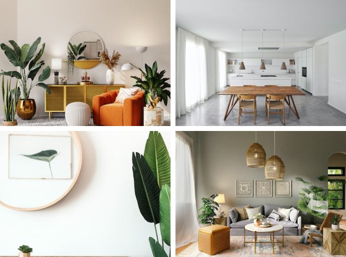
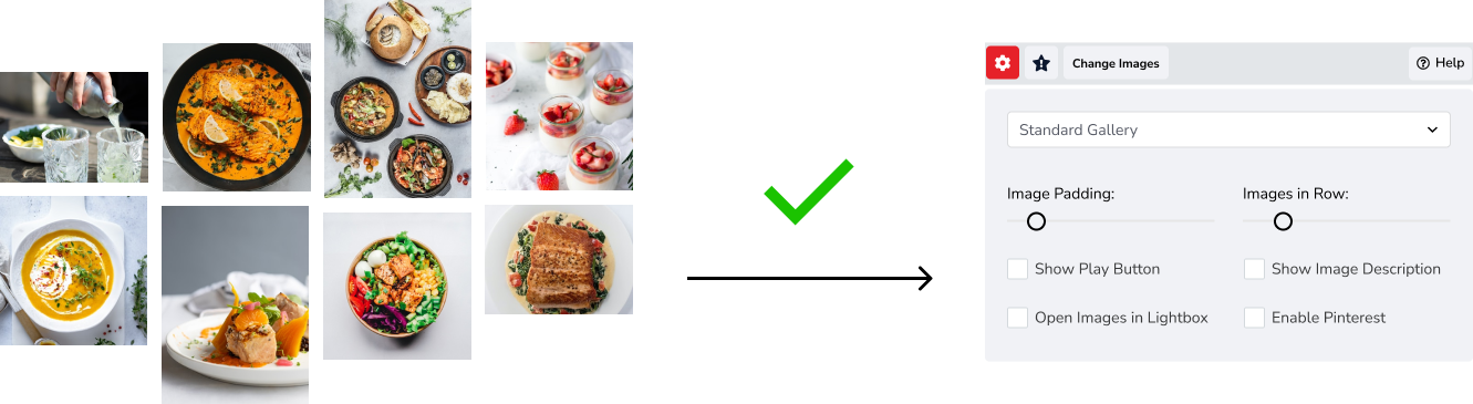
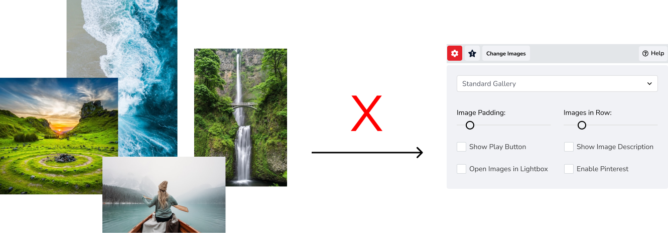
1. There was no way to inform website visitors that the gallery was going to open in a lightbox (if lightbox mode was on). I resolved it by showing users with an “expanding” icon that images would expand when clicked.

Lightbox On
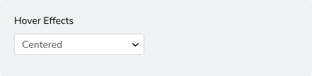
2. There was no way for Website Owners to pick a hover effect when descriptions for gallery images were available. To give users more control, I added 7 new design options.
Some designs listed below:

Underlined

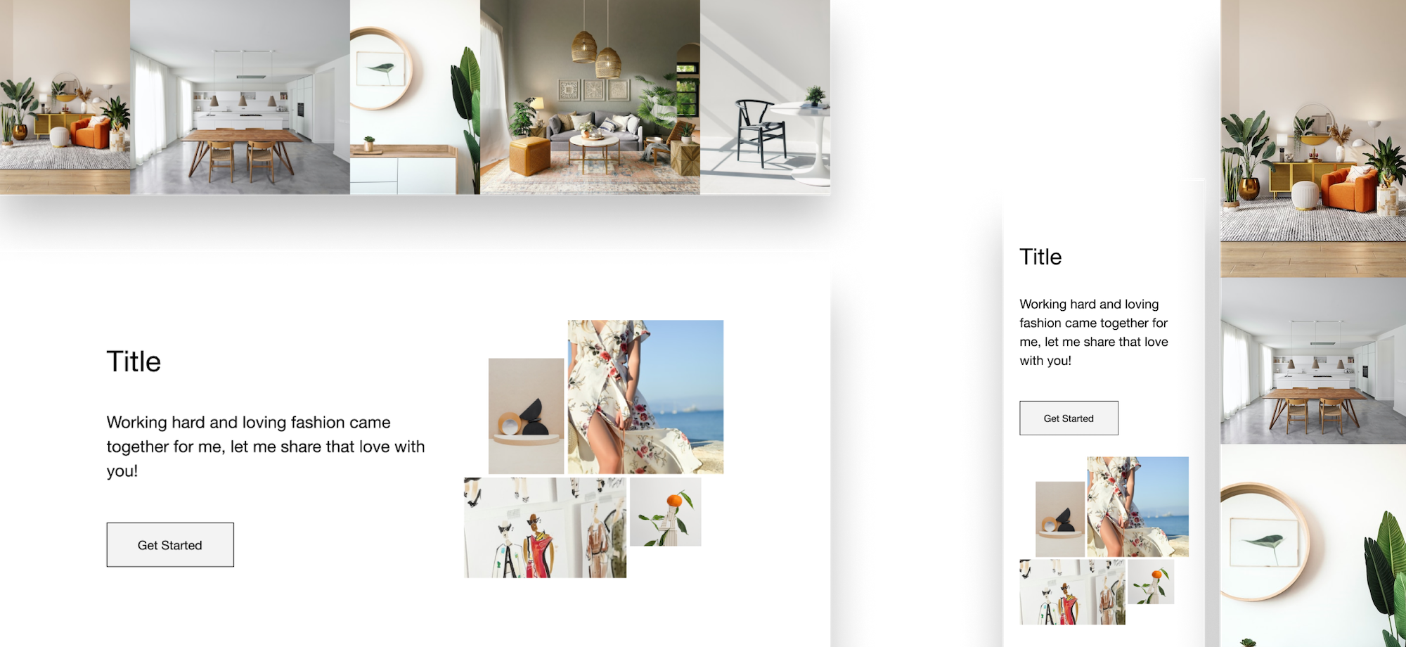
Framed
How the Editor Changed
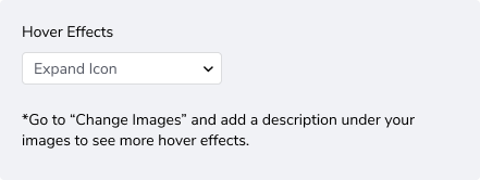
New design options required a way to display them in the builder. I added an icon that represents “hover”, which opens a lower section with 3 scenarios. To manage expectations, the displayed text changes depending on the scenario.

Scenario 1: User has not entered any description text and lightbox is on
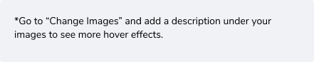
Scenario 2: User has not entered any description text and lightbox is off
Scenario 3: User has entered description text in at least one image and the lightbox is on. They can only choose one hover effect, and will see the options in the same list.