Putting People First With a Website Redesign

About Inflo HR Ltd.

Inflo HR Ltd. is a technology-driven human resources and brand management company that supports small to mid-size businesses in aligning their business strategy with their people.

Challenge

The old website was using a generic theme resulting in challenges with usability and accessibility. As a result, website visits were below the average for the business size and people weren’t seeing what Inflo HR had to offer.

Opportunities

I had an opportunity to elevate the usability, accessibility, and just overall look of the website to better serve people and businesses.

Role and Duration

I worked on this project directly with the owner of Inflo HR and a Marketing Associate. My work included user research, design, and development. However, this case study will only focus on the research and design parts of the process. Duration was 3 months.

The Process

1. We Defined Two Types of Affected Users  

Job-seekers: people looking for work
Employers: companies looking to hire people

2. What Kind of Experience Did Job-Seekers and Employers Had During the Hiring Process?

User Interviews With Job-Seekers

Interviewed 4 people to see the day to day when looking for a job. 2 of them were employed and looking for a new role and 2 were unemployed.

These are some of the discoveries:
a) Frustrations with being ghosted by recruiters
b) Not being able to see how far in the hiring process a company is (for example, applying to a role that has already being filled or is in the final stages of interviews because it’s still posted)

“Kind of like when you buy tickets it says 80% sold out and you think oh I need to apply now to make sure I get a ticket. In the case of a job I just wouldn’t apply if they are in the final stages of interviews because at that point it’s just a loss of time to create an application just receive an automated rejection”

c) Due to financial constraints, when looking for help with resumes, they normally wouldn’t hire an official HR (Human Resources) representative but they were relying on career consulting already available to them via school, courses, etc.
d) Automated hiring processes - they wanted more transparency with knowing whether their resumes were being looked at by a person or a machine.
It seemed that the challenges Job-Seekers were facing all went back to transparency, respectful human interaction and less automation in the hiring process. 

Inflo HR could accentuate their dedication to putting people first and create a safe space for applicants. They could also provide access to free and affordable tools Job-Seekers could use to create glowing applications.

User Surveys With Employers

I surveyed 6 employers of all business types to find out more about their general challenges around hiring people. The findings followed:

a) Most of companies who didn’t use HR services considered that there was a scarcity of qualified candidates or receiving too many applications from candidates that didn’t match the job description. This created a big pool to draw from and it was hard to sort.
b) 20% said they had found an HR website they though was helpful to them because of the following reasons: they could research useful content, they could easily book a call through the website, they could pay for the services on the website, it loaded faster than other websites

Inflo HR wanted to focus on the healthcare industry so I created another survey that was only focussed on healthcare. I received 7 responses with the following feedback:

a) Overwhelming response to the question about difficulties encountered while looking for talent was “not enough technology to make the process easier
b) When asking if they had used HR services before, they responded that they used HR services for specific needs such as HR Management or Benefits Administration
c) Top answers about what they were looking for in an HR website were: affordable price, accessible website, examples or success stories, and to be able to book a meeting with the HR professional through their website
Companies who didn’t use HR services were challenged by the volume of applications. Our focus was on how to convince small businesses to hire an HR professional to filter applications for them. This was an opportunity to accentuate that our company was using modern ways to manage applications such as social media recruitment marketing.

When it came to the healthcare industry, which did use HR services, we just needed to provide a clear list of services they could choose from. Other important features: accessible website, success stories, a way to book a meeting with the HR professional.

3. Learning From the Old Website

The previous website recorded a mere 205 sessions per week, indicating a significantly low engagement rate. Moreover, its alarming bounce rate of 90% suggested that an overwhelming majority of visitors left the site after viewing just one page.

To evaluate the old website with a user-centric approach, I employed Jakob Nielsen's 10 fundamental principles of interaction design (rules of thumb in design: https://www.nngroup.com/articles/ten-usability-heuristics/). After a thorough analysis of the website, I distilled my findings to focus on the most impactful aspects:
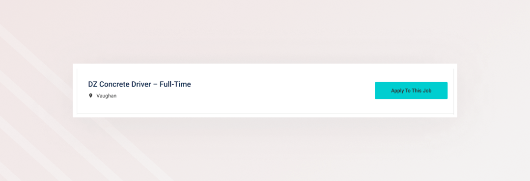
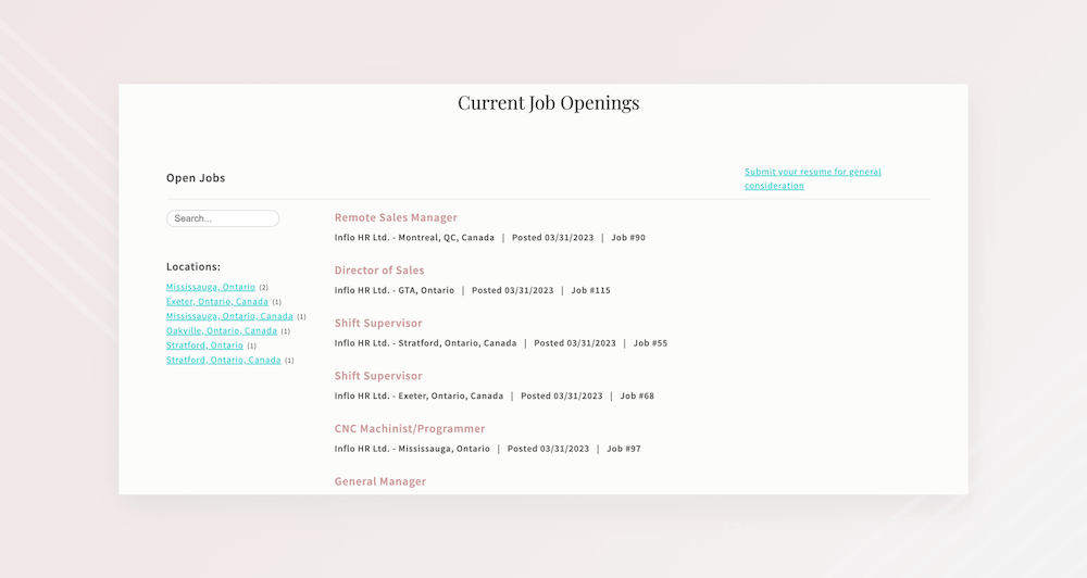
The "Jobs" page showed a list of available positions with a call to action on each one: “Apply To This Job”. However, the button led users to a description about the job position. Due to the naming, some people may think that if they press that button they would activate the application process.
There was an opportunity to make the button “See Details” or just make the job listing a link that users can click to see more information. Once they are on the job page, they can see an "Apply" button.
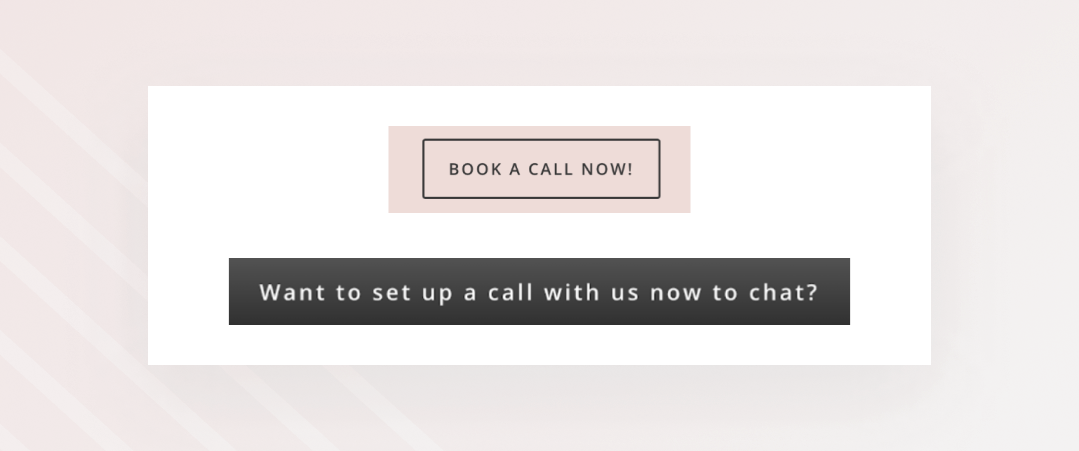
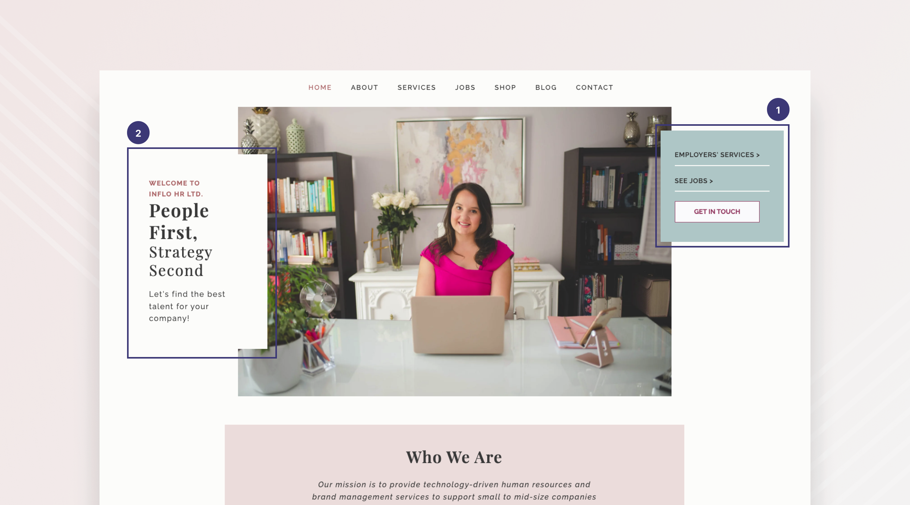
There was an inconsistent button design for the same action across the website (uppercase letters vs. capitalized, inconsistent button size).
Opportunity was to make buttons consistent across the board.
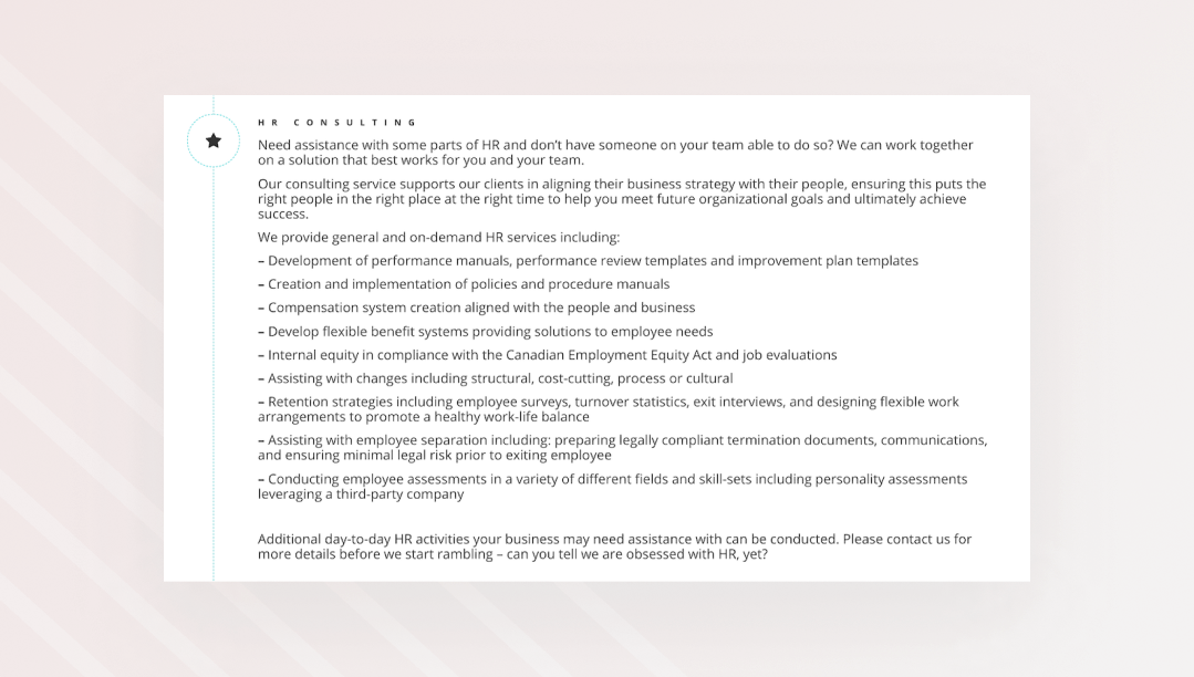
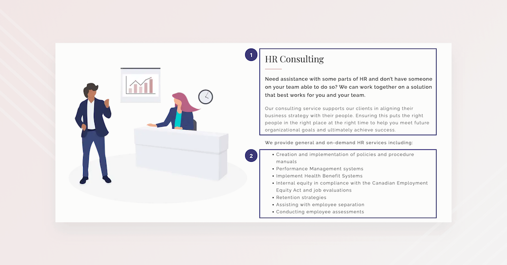
The "Services" page was burdened with dense descriptions for each service, all presented in a single style of text that hindered efficient scanning.
There was an opportunity to create more easily scannable descriptions of services by playing with text styles to create hierarchy.
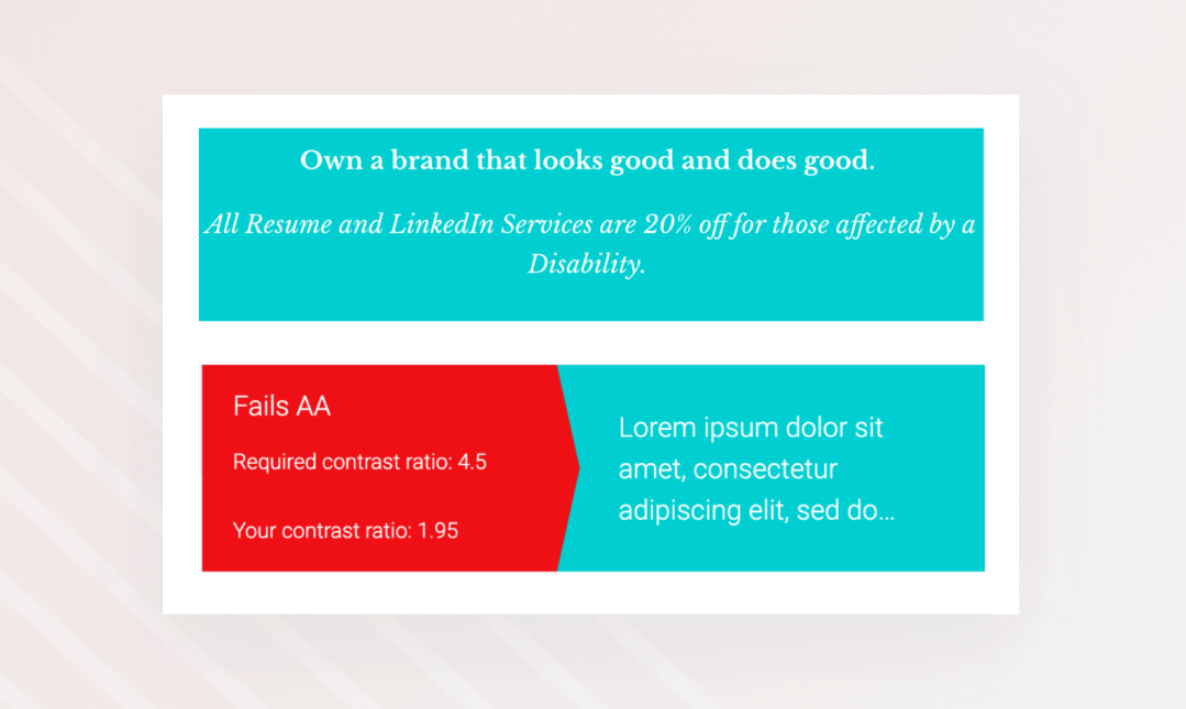
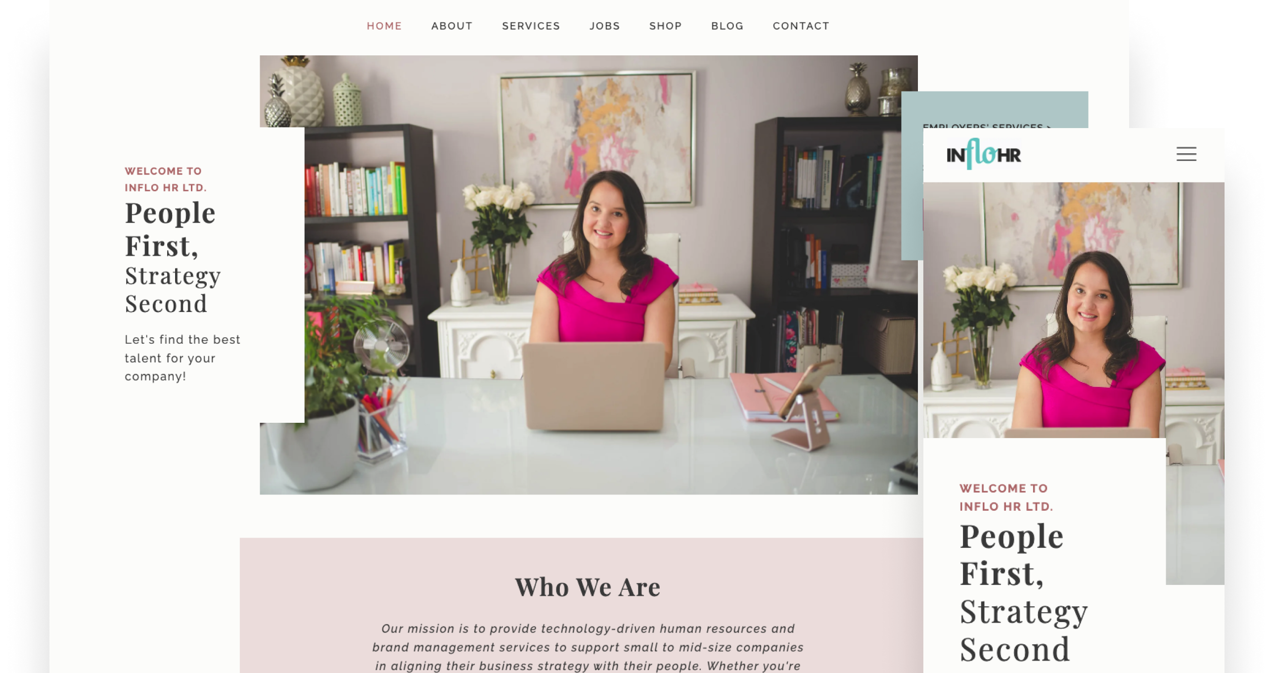
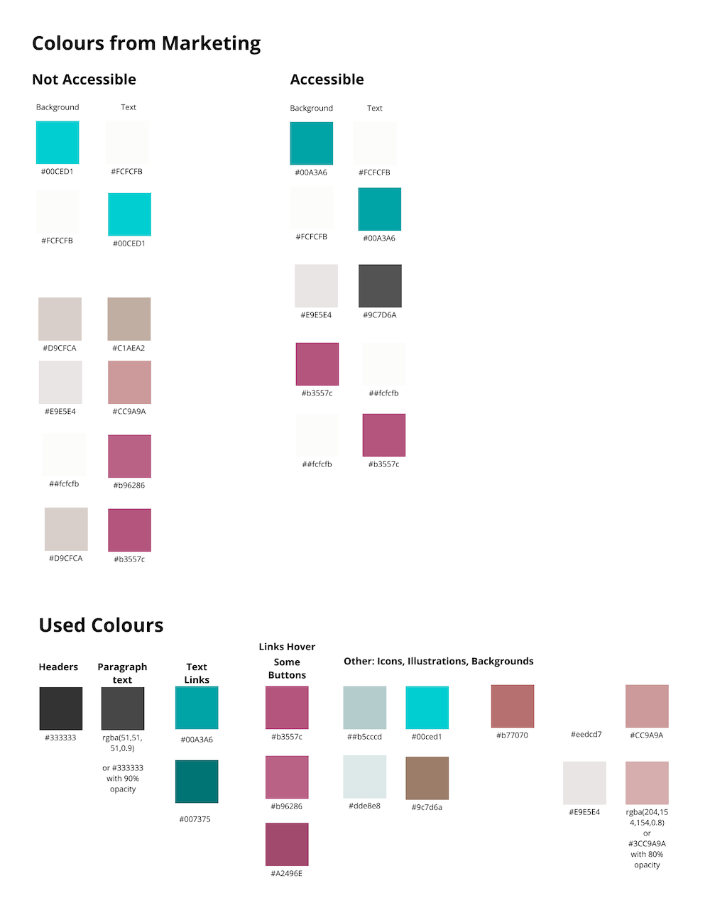
Accessibility checker showed that there was low contrast between white background and teal text and teal background and white text which was the dominant colour combination.
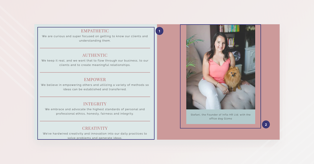
The opportunity was to rebrand and showcase the other colours of Inflo HR while also focussing on good contrast.

4. How the New Website Solved User Challenges

On the Homepage

1
I created an entry point for both user types: “Employers’ Services” for Employers and “See Jobs” for Job-Seekers as well as a contact button for easy way to connect to our HR professional (mentioned as important by Employers during the surveys)
2
I highlighted that Inflo HR focusses on people to show Job-Seekers that we care but also reassure companies that we will put the effort into finding the right talent for their company.
3
Testimonials provide the social proof companies mentioned they needed through the survey.
4
Focussing on showing Employers that we use modern technology and we can successfully filter through their applicants so that they only receive the applications that match their job descriptions. Inflo HR has the perfect combination of technology and human touch, since both Job-Seekers and Employers have direct access to the founder.

On the "About" Page

1
This page is further creating a relationship with the users by presenting more information about the founder of Inflo HR but also the company’s mission to understand people, create meaningful relationships, empower others, and lead with integrity.
2
An image with the office pet makes Stefani, the founder of Inflo HR, approachable and relatable further deepening the human touch that people need during the hiring process.

On the "Services" Page

1
From a User Interface point of view, to resolve the issue with text-heavy sections, I added multiple font styles to create a hierarchy.
2
From a User Experience point of view, this page shows a clear list of services so that Employers know exactly what they get when working with the company since many of the healthcare employers mentioned that they use HR only for specific needs.

Easy-To-Scan "Jobs" Page

This page provides a list of available positions for Job-Seekers. Each job title is a link to a page with more information and a button to apply. No more confusing buttons on the list of available positions.

Accessible Resource for Job-Seekers in the "Shop" Page

This page features the “Improved You Bundle”, a guide that Job-Seekers can use to create a glowing job application. This way we can help them reduce some of the frustrations while applying for a job. We wanted to showcase that the founder of Inflo HR wanted to make this bundle accessible and affordable since many Job-Seekers mentioned that they couldn’t afford one-on-one sessions with a career counselor.

On the business side, this would create passive income for Inflo HR.

Creating Consistency With Global Sections

To resolve the issue of inconsistency on the old website, I tried to add components where possible. For example, this section is the call to action on most pages, creating a sense of familiarity and consistency.

5. Rebranding to Improve Accessibility

I worked with the Marketing Associate on rebranding Inflo HR. They created a new colour scheme with colours deriving from the old branding, slightly modifying them to remove focus from teal which used to be the dominant colour. I then tested the new colour scheme for accessibility and created an accessible colour palette for the website.

6. The Final Product 

The final product was a website that successfully presented Inflo HR's focus on providing accessible ways for Job-Seekers to create glowing job applications and an easy way for Employers to manage different aspects of their human resources. 
See The Final Website

Constraints

Limitations on the job listing design due to the fact that it’s a code block from a third-party service (not native)
Technical limitations to make the website fully accessible with the current website builder; no way to edit for screen readers

Results

Number of sessions increased by 36.5%
Bounce rate reduced by 28%

Future Considerations

Replace generic illustrations with custom illustrations
Reduce number of font families
Develop a native hiring tool
Improve accessibility on the back-end. While I put a lot of effort into having good accessibility in the user interface choices, I was limited by the builder the back-end for what I could do for screen readers.
As Inflo HR's business continues to mature, it's inevitable that the size of companies working with it will change. With this evolution in mind, the website must also adapt to effectively cater to the needs of its expanding clientele.
Let's make something great together!
viktorija.gjorgjievska@gmail.com
magic-wanddicelaptop-phonechart-barsarrow-right